How to fix List Item Indentation in WordPress
Making your blog or website look attractive is often a case of fixing a large number of minor cosmetic issues.
The default styling in some WordPress themes can be also be a hindrance.
Here we show you how to change the position of bullet points in list items to work better with multi-line text.
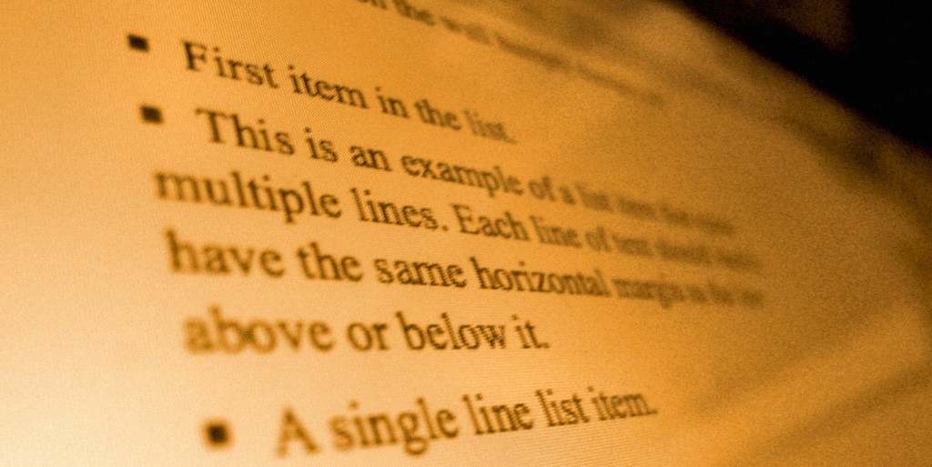
Let’s say that you have a list of items on your page. The problem happens when the text of one of the items wraps around onto a new line – the text becomes aligned with the bullet point instead of the line above it. It could look something like this:

What’s happening is that list-style-position: inside is being set somewhere in your theme’s stylesheet.
In our case, it was being set as part of the “.entry” CSS class.
Anything in the “entry” class controls how the content of a post or a page is displayed. It styles everything within the post below the title, but it doesn’t affect the rest of the page such as the sidebar and heading etc.
Changing list-style-position to outside will now shift the bullet points left, so that the text on each line is aligned.
Now the list looks like this:

Note that this change will actually shift your list to the left, so you may need to compensate for this by increasing the padding value. (In some cases, the bullet points may actually appear cut-off due to being moved too far left.)
This could be done with something like the following:
Editing the stylesheet
To add your own custom CSS, you can either create a child theme, or use a Custom CSS WordPress plugin.
Some themes may have a file such as “custom.css” for custom changes. You can usually directly edit this, and it won’t be overwritten if you update the theme.
However, be careful about directly editing the style.css file, since you may lose changes made here after updates.
Not using WordPress? You can still go ahead and use these modifications in the stylesheet of your website or blog.
Bonus style tip!
The standard HTML bullet points are a little ugly, so you may think of replacing them with something else. You can use an image instead, and there’s a good guide here on how to do this.
However, with more devices using Retina style displays, this can be a problem, since the text on the page may be rendered at a different resolution to your images. This could make your bullet-point image look a little blurry. Fortunately, it’s possible to use special characters as bullet points too.
For example, this is using a double-chevron as the bullet:

To use this, first disable the normal list styling (adapt for your stylesheet):
Now add in the chevron with something like this:
“:before” is a special selector which can be used to insert content before each list item.
The “\00BB” is the hex code for the chevron character, and “\0020” is simply a space. The float and margin attributes ensure that the lists are indented correctly.
You can also change the colour and font size of the bullet point here too, just like any normal text.
With this setup, the list-style-position modifier is no longer used, since we’re no longer using the built-in list styles. Instead, you can tweak margin and padding settings in the code above if you need different indentation.
Do you have any tips for styling lists in WordPress?
Let us know in the comments below.


thank you this post is realy helpfull
Pow! Perfect for those times when your brain is fried from staring at code too long! Quick and easy fix. Thanks!
Thanks for this. It is most helpful.